To add, edit, or delete widgets, go to Portals > Administer Portal Pages in the administrative menu.
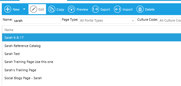
On the Overview screen, highlight the name of the portal page that you want to edit widgets on and click Edit in the top toolbar.
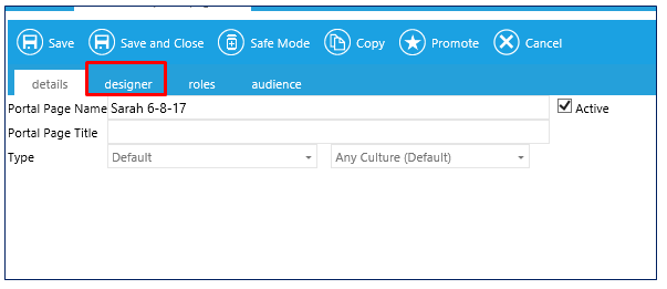
Once the page opens, click on the Designer tab.
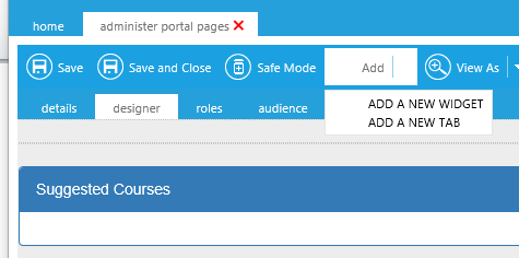
Click Add and select Add a New Widget from the drop-down menu.
The widget library will open up.
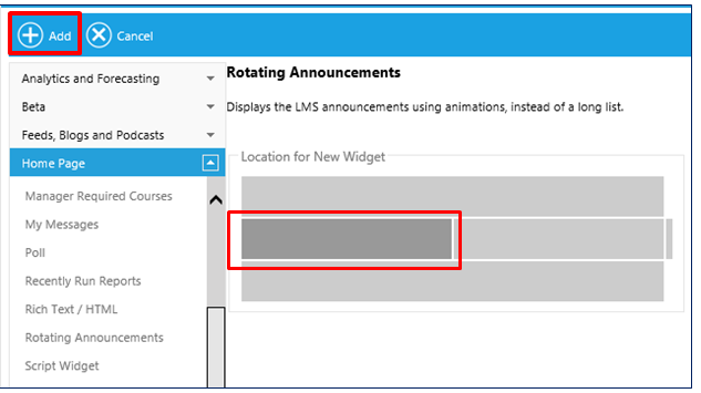
Scroll through the list of available widgets and select the desired widget. The purpose of the widget categories is to allow you to easily find the desired widget. Any widget can be placed on any page type. A complete list of available widgets can be found in the online help.
On the right side, click the area on the page where the new widget should be located. Standard options are:
Not every location must be used. If there is no widget selected for a certain spot, then that area will just not appear. For example, if no top widget is selected, then the page will just have two columns at the top.
Click Add to add the widget.
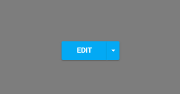
Most widgets have customizable settings. To edit a widget, click anywhere within the widget. The Edit option will appear. Click Edit to open up the widget options.
While some of the options will vary by widget, all widgets will have the same general edit options:
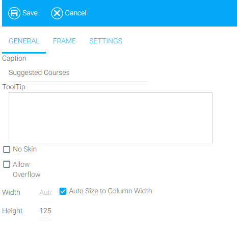
When you hide the border, a thin border will still appear around the widget in the Setup screen. When this widget is displayed to the end-user, no border will be visible.
This optional tab can be used to provide basic formatting for a widget.
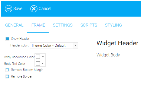
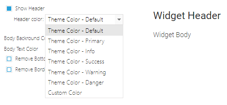
Show Header is selected by default. Deselect the checkbox if you do not wish to display the widget header.
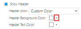
Header Color can be set to a variety of pre-made theme colors or a custom color. Click on the drop-down to change the header color.
To enter a custom color, click on the custom color option. Two new options will appear, Header Background Color and Header Text Color.
Click on the arrow next to either the background color or text color. A color selection grid will appear. Select a color on the grid, or enter the desired hexadecimal color.
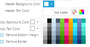
Other widget color options include:
If you selected the No Skin option on the previous tab, then the header options will not be shown, since the header is not displayed when there is No Skin.
The Settings tab will vary by widget, and some widgets do not have a Settings tab. See the Online Help on the specific widget for Settings tab instructions.
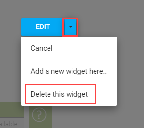
To delete a widget, click anywhere within the widget. The Edit option will appear.
Click on the down arrow next to Edit and select "Delete this widget" from the drop-down menu.